The fascinating stories behind iconic car logos
Discover the surprising origins and hidden meanings behind some of the world’s most iconic car logos, emblems that tell stories far beyond their design.
Many of today’s most iconic emblems carry a rich history, with design elements that reflect a brand’s birthplace, pay tribute to its founders, or symbolize engineering milestones that changed the industry. From humble beginnings in small workshops to global recognition, these logos have evolved alongside the companies they represent.
We’ll uncover the fascinating stories behind some of the world’s most recognizable automotive symbols, and the hidden meanings you may have never noticed.
Toyota
Toyota originally began as a manufacturer of industrial looms under the name Toyota Automatic Loom Works. Many believe that the inner oval in the logo represents a needle, with the space around it symbolizing an invisible thread, a subtle tribute to the company's roots in textile engineering.
Additionally, the negative space within the logo cleverly forms every letter in the word “TOYOTA” when broken down, an intentional design detail admired by logo enthusiasts for its simplicity and brilliance.
Subaru
The Subaru logo features six stars representing the Pleiades star cluster, which is called "Subaru" in Japanese. It symbolizes the merger of five companies into one, Fuji Heavy Industries, Subaru’s parent company. The large star represents the parent company, while the five smaller stars represent the merged firms, highlighting unity and heritage.
Interestingly, the six stars are arranged to reflect their actual position in the night sky, a subtle nod to astronomy and Subaru’s attention to precision.
Mitsubishi

The iconic three-diamond logo of Mitsubishi originates from the combination of two family crests. It merges Yataro Iwasaki's three-tiered chestnut crest with the three-leaf oak crest of the Yamanouchi family from the Tosa Clan. Fittingly, the name “Mitsubishi” translates to “three diamonds” in Japanese.
The logo has remained virtually unchanged since 1870, making it one of the oldest and most enduring corporate logos in the world.
BMW
The BMW logo, introduced in 1917, features a simple yet meaningful design: a blue and white checkered pattern within a circular emblem. The colors are a nod to the Bavarian flag, reflecting BMW’s roots in Bavaria, Germany. The outer circle represents the company’s global reach and its legacy as a premium car manufacturer.
The logo is often mistakenly thought to represent a spinning propeller, due to the company’s early history in aviation. BMW originally manufactured aircraft engines during World War I, and the logo’s design is said to symbolize the motion of a propeller, even though it officially stands for Bavarian heritage. This rumor was further fueled by a famous advertisement featuring a spinning propeller that showcased the BMW logo, making the connection even more widespread.
Mercedes-Benz

The Mercedes-Benz logo features a three-pointed silver star encircled, symbolizing the brand’s dominance in land, sea, and air. Introduced in 1926 after the merger of DMG and Benz & Cie., the star represents quality, luxury, and innovation.
The logo was designed by Gottlieb Daimler’s son-in-law, Emil Jellinek, who was deeply involved in the company’s branding. He also named the 'Mercedes' after his daughter, Mercedes Jellinek.
Audi
The Audi logo consists of four interlocking rings, symbolizing the four companies that merged to form Auto Union in 1932: Audi, DKW, Horch, and Wanderer. Each ring represents one of these brands, which came together to create a stronger, more competitive company in the automotive industry.
The Audi name comes from the Latin translation of August Horch’s surname. Horch, meaning "listen" or "hark" in German, was chosen as the name for his new company after he left his previous one. To avoid trademark conflicts, a business partner suggested using "Audi," the Latin version, which perfectly captured the essence of the brand, "listen."
Porsche
The Porsche logo combines the colors of the Württemberg state flag and the Prussian imperial eagle, reflecting the brand's roots in Stuttgart, Germany. The emblem features a horse, the symbol of Stuttgart, as the city was originally a horse breeding farm. The logo represents luxury, performance, and engineering excellence.
The horse in the Porsche logo also signifies the strength and speed of the brand's vehicles, and the logo's design is deeply rooted in the historical identity of Stuttgart, blending regional pride with Porsche’s automotive legacy.
Alfa Romeo
The Alfa Romeo logo features a red cross and a serpent, combining the Italian flag’s symbolism with Milan’s historical identity. The red cross represents Milan, the city where the brand was founded, while the serpent (known as "Biscione") symbolizes the Visconti family, once rulers of Milan. Together, they reflect the brand's heritage, strength, and connection to Milan.
The serpent in the logo is often depicted as devouring a man, symbolizing victory and dominance. However, Alfa Romeo has stated that it is not about the man being devoured, but rather about the man exiting from the serpent’s mouth, representing the resurrection of a new man, signifying rebirth and transformation.
Lamborghini
The Lamborghini logo features a bull, symbolizing strength, power, and aggression, reflecting the brand’s commitment to performance. The bull was chosen by Ferruccio Lamborghini, the founder, who was a passionate Taurus zodiac sign. The logo’s gold and black colors emphasize luxury and exclusivity, aligning with Lamborghini’s high-end image.
The bull in the logo is not only symbolic of Ferruccio’s zodiac sign but also references his love for bullfighting. In fact, the Lamborghini logo bull is often associated with the famous fighting bulls of Spain, further intensifying the brand’s aura of power and dominance.
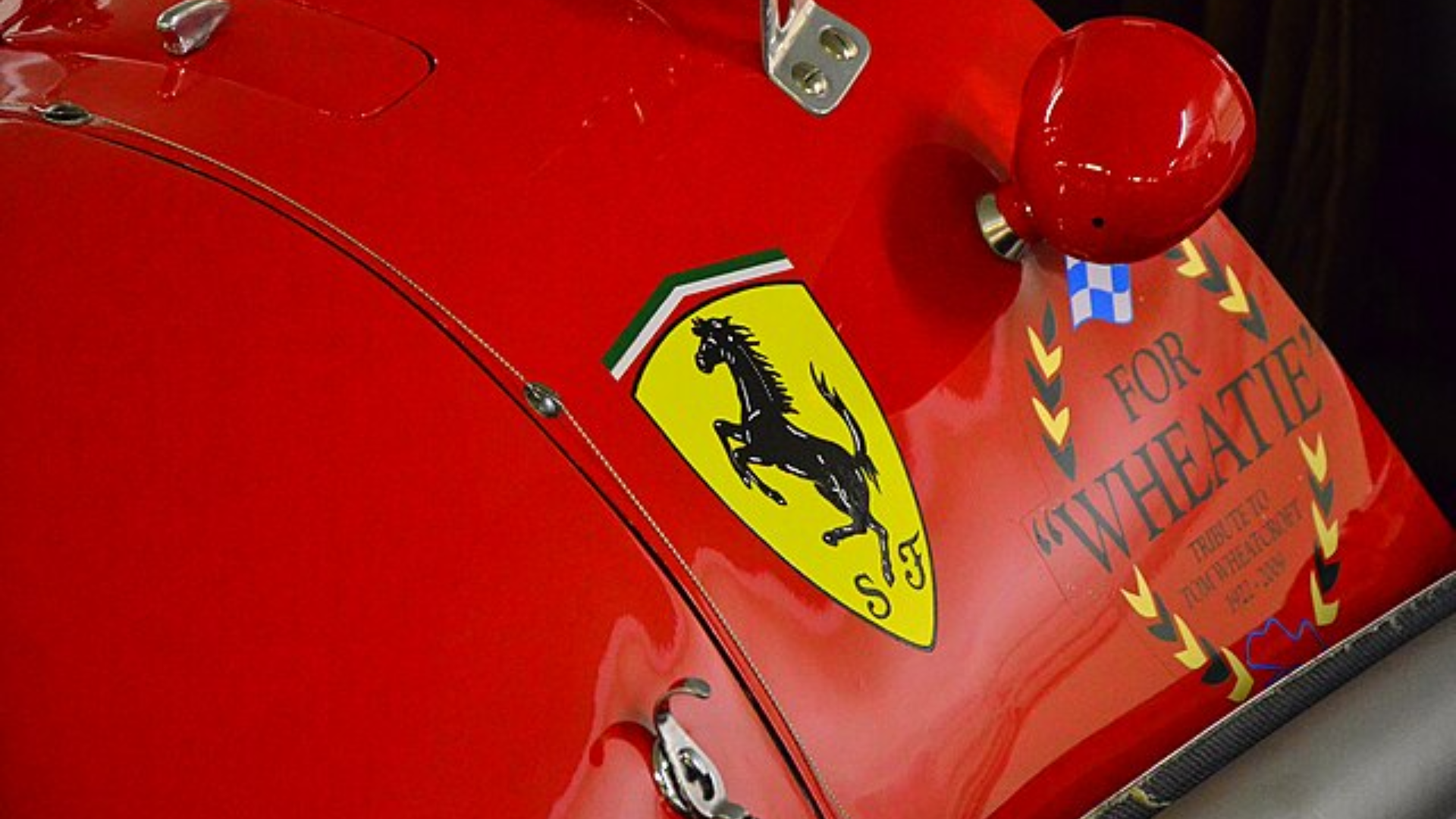
Ferrari
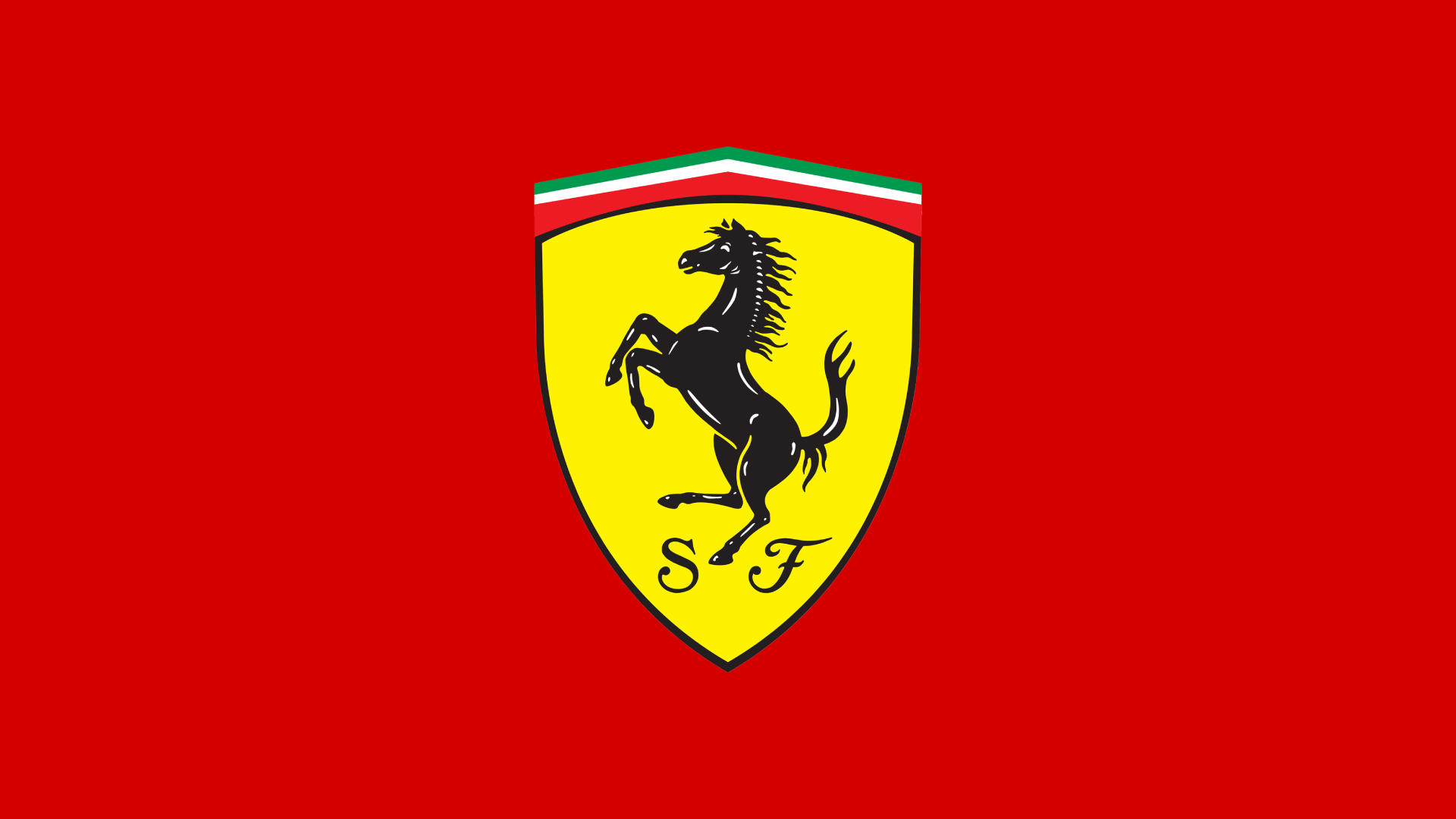
The prancing horse in the Ferrari logo originates from Francesco Baracca, a famous Italian flying ace during World War I, who painted the symbol on his aircraft. After Baracca’s death, his fellow soldiers began painting the horse in black as a sign of mourning. In 1923, Enzo Ferrari, founder of Scuderia Ferrari, met Countess Paolina Baracca, Francesco’s mother, who suggested he use the prancing horse on his cars for good luck.
The yellow background in the Ferrari logo pays tribute to Modena, Ferrari's hometown, while the letters “S F” stand for Scuderia Ferrari, Ferrari’s racing team.
